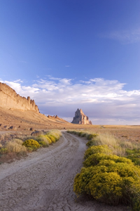
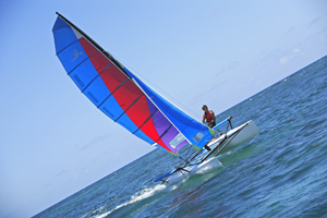
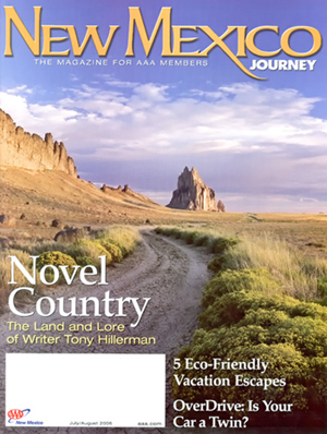
The most coveted photo among editorial photographers is the cover shot. It commands the highest fee in a magazine and offers the most exposure to the photographer. To take a saleable cover shot, you have to think about it in a special way. Here’s a little quiz, to test your editorial photo savvy… Here are three photos I took at different times, in different places. One of them made the cover of a magazine. Which one do you think it was?


They’re all good, magazine-quality shots. But this is the only one that made a magazine cover:

Here’s why… **The first image of a man sailing a catamaran has a number of attributes that are often found in cover shots: bright and colorful (features that attract the eye), dynamic (tilted horizon and full sails), and plenty of copy space on either side. However, the image is horizontal and therefore not likely to be selected as a cover shot, since magazines are produced in a vertical format. **Next, the close-up image of a tulip was shot in the vertical format, is also bright and colorful, and has plenty of copy space at the bottom. However, the tulip’s bulb is too close to the top, so the magazine’s name (say, “National Geographic”), would cover the most striking aspect of the image. This image is therefore an unlikely candidate for a cover shot. **The final image of a dirt road in the desert is vertical; has plenty of room at the top for the magazine’s name; has copy space at the bottom (where words can be added over neutral subjects without covering Shiprock itself); features colorful, yellow shrubs in the foreground; and the dirt road leads the viewer’s eye into the picture. The image was chosen as the cover of AAA’s New Mexico Journey magazine, in an issue featuring Tony Hillerman’s novels about a Navajo detective. Keep in mind that these are general guidelines, and every magazine has a distinct editorial aesthetic. It is always a good idea to fine-tune your cover-shot image submissions by reviewing previous cover shots from each particular magazine. Note: You might have noticed that the cover image is slightly different than the submitted image. This is because magazines often crop and otherwise alter submitted images to suit their design and aesthetic needs. In fact, it is common for magazine licensing contracts to include language that gives the magazine the right to make these changes. In my experience, changes made by magazines are usually minor and within what’s generally accepted in the industry. In addition to cropping, common alterations include minor changes to saturation and contrast. [Editor’s Note: Learn more about how you can turn your pictures into cash in our free online newsletter The Right Way to Travel. Sign up here today and we’ll send you a new report, Selling Photos for Cash: A Quick-Start Guide, completely FREE.]
Travel Photography Resources
5 Dos and 2 Don’ts for Travel Photography
Take Great Photos And Get Paid More For Your Travel Articles
Turning a Photography Hobby into a Monthly Income
The Pros Of Selling Your Images As Stock Photography
16 Mobile Photography Tips And Tricks Every Photographer Should Know

