One of the most common questions I get when discussing photo submissions to magazines is how much image editing is too much. Fortunately the answer is easy: it depends. Unfortunately, “depends” means there is no bright line to help photographers answer the question. But all is not lost. The following general concepts should help you determine how much manipulation is too much.
First of all, when I say “editorial,” I mean publications such as newspapers, text books, and magazines. These publications disseminate newsworthy information dealing with such things as current events, travel, education, the arts, history, and entertainment. Within the editorial world there are differences on how much you can manipulate an image.
Most newspapers and some magazines do not accept images that have been changed in any substantive way and only allow minor adjustments like contrast and color correction. Adding or deleting anything from an image is strictly forbidden, as is staging a shot. An example of a magazine in this category is National Geographic.
On the other end of the spectrum are some travel publications, which, in essence, are more interested in featuring a concept rather than a literal depiction of reality. These magazines typically do not have restrictions on removing distracting objects from an image, drastically changing the image’s color balance to create a special look, or even adding elements to enhance a picture’s visual appeal.
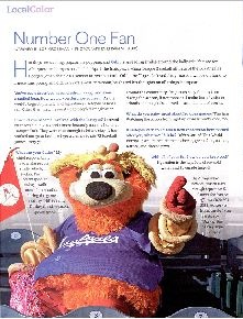
An example of a magazine in this category is Conde Nast Traveler, which uses highly stylized photography and stages shoots with professional models. By way of a personal example, I was recently sent on assignment to photograph Orbit, the mascot of the Albuquerque Isotopes AAA baseball team. One of my shots was supposed to show Orbit waving an Isotopes banner.
But, on the day of the shoot, the team’s PR rep forgot to bring the prop. I photographed Orbit without the banner, and the magazine’s art director added the banner in post-production. This is not uncommon in travel magazines but would be unacceptable for a newspaper. Here’s the final photo:
Now take a look at these next two photos below. This second set of images depicts a garden and a country house in El Rancho de las Golondrinas, a living history museum near Santa Fe. The first shot, a “straight” version of the image, would be appropriate for magazines. The second image has been altered with a digital brush to achieve a painterly look, and would likely not be published in a travel magazine (though it could be sold as a fine art print).
The bottom line is that every magazine is different regarding what is acceptable manipulation. When you are preparing a photo submission you need to:
** 1. Review the submission guidelines carefully to see if any restrictions apply…
** 2. Review the magazine itself to determine its style.
[Editor’s Note: Learn more about how you can fund your travels and make an extra income with photography, travel writing, blogging, and more in our free online newsletter The Right Way to Travel. Sign up here today and we’ll send you a new report, Five Fun Ways To Get Paid To Travel: A Quick-Start Guide, completely FREE.]
Travel Photography Resources
5 Dos and 2 Don’ts for Travel Photography
Take Great Photos And Get Paid More For Your Travel Articles
Turning a Photography Hobby into a Monthly Income
The Pros Of Selling Your Images As Stock Photography
16 Mobile Photography Tips And Tricks Every Photographer Should Know


