“Oops!”
“Darn it!”
“Missed another one.”
These are some of the things I was saying to myself as I was trying to get a decent shot of fast-moving traffic in downtown Hanoi. I was fascinated by the variety of vehicles streaking past me, from conventional cars to motor scooters to bicycles, all engaged in a vehicular do-si-do, where the only rule seemed to be: Don’t get hit. Although I had a lot of fun, I missed a lot of shots.
Photographing moving traffic in a busy street is one thing; photographing moving traffic in a well-composed way that tells a story is quite another.
As I always do, I tried different angles and compositions, trying to capture the organized chaos of the scene in front of me. Some of my images were horizontals, others verticals, and some others slightly tilted. I used a wide angle for some of my shots, tighter compositions for others. Some of my photos included a few vehicles and their occupants, while others included large groups. I also used what I call “photography’s fourth dimension” for some of the pictures.
Let me explain…
All images have two physical dimensions: height and width.
And you can also imply depth (the third dimension) by using some compositional tricks such as leading lines.
Then there’s the fourth dimension, which implies the passing of time, and can be achieved by blurring a photo (part or all).
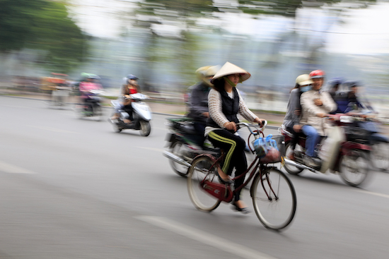
Here’s what I mean… take a look at one of my favorite shots from Hanoi:
I believe it works compositionally by placing the main subject, the lady on a bike wearing a conical straw hat (called a nón lá in Vietnam), on the right side of the frame, followed by other vehicles behind her (typical Rule of Thirds composition).
It also works because the straw hat tells a story: This picture was most likely taken somewhere in Asia, and probably not in Dubuque.
What makes the image unique, however, is that it is blurred.
Although most of the time a blurred image is unacceptable for publication, in this case it’s obvious that I was going for the blurred effect. Notice how the subject is relatively sharp compared to the rest of the image, and the background is a blurred streak, implying movement. The image does a good job of depicting the movement and chaos of the scene—qualities that would have been harder to convey had everything been in focus.
Not all subjects look attractive when blurred, but many are (especially those that are moving already), so it’s important to keep in mind photography’s fourth dimension as an option. The more uncommon your image is, the better the chances are of its being selected for publication.
Travel Photography Resources
5 Dos and 2 Don’ts for Travel Photography
Take Great Photos And Get Paid More For Your Travel Articles
Turning a Photography Hobby into a Monthly Income
The Pros Of Selling Your Images As Stock Photography
16 Mobile Photography Tips And Tricks Every Photographer Should Know


